
Expert Assignment Solutions with 100% Guaranteed Success
Get Guaranteed success with our Top Notch Qualified Team ! Our Experts provide clear, step-by-step solutions and personalized tutoring to make sure you pass every course with good grades. We’re here for you 24/7, making sure you get desired results !
We Are The Most Trusted
Helping Students Ace Their Assignments & Exams with 100% Guaranteed Results
Featured Assignments
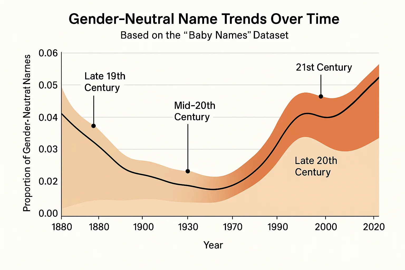
Visualizing Gender-Neutral Name Trends Over Time
Data VisualizationClient Requirements
The student needed to analyze the 'Baby Names' dataset to examine how gender-neutral names have shifted in popularity between male and female over time. The task was to identify trends and visualize the changes in the usage of gender-neutral names.
Challenges Faced
We ensured that the dataset included a sufficient number of gender-neutral names to analyze. The student faced complications in defining and categorizing gender-neutral names and in selecting appropriate visualization techniques to represent the trends effectively.
Our Solution
We guided the student to filter the dataset for gender-neutral names and to create stacked area charts and line plots to visualize the trends over time. The student also calculated the proportion of gender-neutral names used each year.
Results Achieved
The student successfully visualized the trends in gender-neutral name usage, providing clear insights into the shifts in naming conventions over time. This assignment enhanced their ability to represent categorical data effectively.
Client Review
Working with them was a rewarding experience. The assignment challenged me to apply theoretical knowledge to practical scenarios, enhancing my understanding of visualizing categorical data trends.
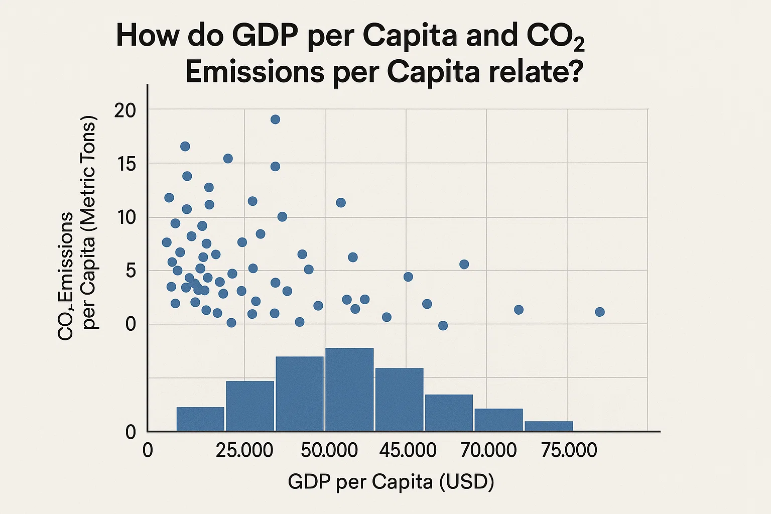
Designing a Custom Visualization for a Specific Data Set
Data VisualizationClient Requirements
The student wanted to design a custom visualization for a dataset of their choice. The task was to select a dataset, define a specific question or insight to explore, and create a visualization that effectively communicates the findings.
Challenges Faced
We ensured that the student had access to a suitable dataset and the necessary tools for visualization. The student faced complications in defining a clear question, selecting appropriate visualization techniques, and ensuring the clarity and effectiveness of the final design.
Our Solution
We guided the student through the process of exploratory data analysis to define a question, selecting appropriate visualization techniques such as bar charts, scatter plots, or network graphs, and using tools like Tableau or Python libraries to create the visualization.
Results Achieved
The student successfully designed a custom visualization that effectively communicated the insights from the chosen dataset. This assignment enhanced their ability to create tailored visualizations that address specific analytical questions.
Client Review
I had an enriching experience working with them. The assignment was well-structured, and the resources provided were instrumental in completing the task efficiently.
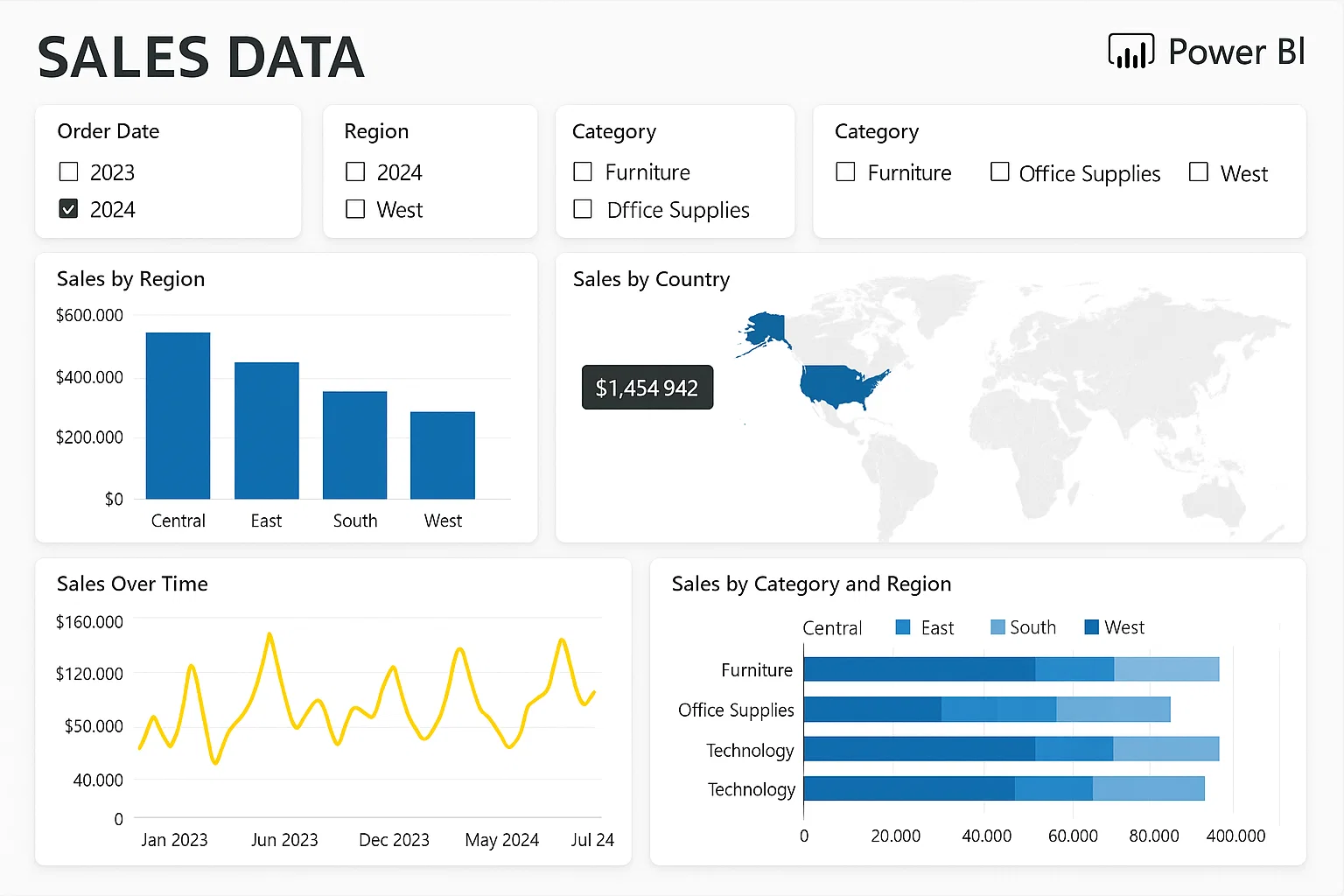
Interactive Dashboard Creation in Power BI
Data VisualizationClient Requirements
The student needed to develop an interactive dashboard in Power BI that visualizes sales data across multiple regions and time periods. The dashboard should include slicers for filtering data, drill-through capabilities, and dynamic visuals that update based on user interactions.
Challenges Faced
We ensured that the dataset contained complex relationships between variables to challenge the student's ability to create meaningful visualizations. The student faced complications in setting up dynamic interactions and ensuring the dashboard was user-friendly.
Our Solution
We guided the student to use Power BI's drag-and-drop interface to create visuals such as bar charts, line graphs, and maps. The student implemented slicers for filtering data, set up drill-through actions for detailed analysis, and optimized the dashboard for performance.
Results Achieved
The student successfully developed an interactive dashboard that allowed users to explore sales data dynamically, providing insights into regional performance and trends over time.
Client Review
Collaborating with them was a seamless experience. The assignment was meticulously structured, and the guidance provided was instrumental in navigating the complexities of creating interactive dashboards in Power BI.
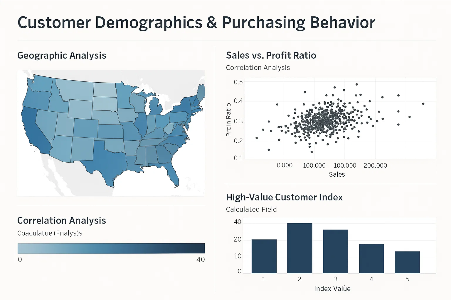
Advanced Visualizations in Tableau
Data VisualizationClient Requirements
The student wanted to create advanced visualizations in Tableau to analyze customer demographics and purchasing behavior. The visualizations should include heat maps, scatter plots, and calculated fields to uncover hidden patterns in the data.
Challenges Faced
We ensured that the dataset included various dimensions and measures to test the student's ability to apply advanced visualization techniques. The student faced complications in creating calculated fields and ensuring the visualizations were both informative and aesthetically pleasing.
Our Solution
We guided the student to use Tableau's features to create heat maps for geographic analysis, scatter plots for identifying correlations, and calculated fields for custom metrics. The student was instructed to apply formatting and design principles to enhance the clarity and impact of the visualizations.
Results Achieved
The student successfully created a set of advanced visualizations that provided deep insights into customer demographics and purchasing behavior, facilitating data-driven decision-making.
Client Review
Their approach to the assignment was thorough and insightful. The feedback provided was constructive, helping me to refine my understanding of advanced visualization techniques in Tableau.